How to Use Color to Impact Holiday Campaigns
When you think of the holidays, what colors come to mind?
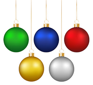
Red, green, white, or maybe even blue and gold. These festive colors can evoke emotions from consumers by drawing them to colors they might not naturally be drawn to outside of the holiday season.
Using color theory, the study of how color impacts perceptions and behaviors, we can help get customers in the mood for the holidays and, hopefully, buy your products. Here's what the experts say about the holiday colors we love.
How to Use Color to Impact Holiday Campaigns
Red
We know red as a warning: fire, stop signs, danger, and so forth.
But it is also a powerful color representing love, passion, importance, and hunger.
Red can raise blood pressure and respiration rates and enhance human metabolism. We think of things like red berries, Santa, and more. Use this color as an accent, and you'll be doing well. However, if used in abundance, it tends to get overwhelming.
Green
Green has both the calming attributes of blue and the excitement of yellow.
When used in a design, it is known to have a balancing and harmonizing effect. It also helps balance out red, which is used often this time of year.
Christmas trees can go back to medieval times to symbolize the Garden of Eden. Today, we tend to think of Christmas trees and mistletoe.
White
Of course, we associate white with snow this time of year.
But it also is an excellent backdrop for design. Since it is the polar opposite of black, it goes with just about every color and is perfect for minimalist design. In addition, it can soften the often bright colors of the season.
Blue
While blue is sometimes acquainted with sadness, calmness, and responsibility, it is also known for its dependability, peace, and religion.
Especially this time of year, we see that blue represents these last attributes. In times past, blue was connected to royalty as the pigments to produce the die were expensive.
Gold
Success! Achievement! Luxury! Elegance!
These are what gold represents, and many individuals associate this time of year with gifts.
Yellow, or gold, is a warm color and represents passion, happiness, enthusiasm, and energy. It's a powerful color, not used in abundance.
When thinking about designing your holiday marketing materials, these colors are tried-and-true, and people instantly associate them with the holidays.
There are always beachy themes and tropical photos, but that typically doesn't represent the classic feel of the holiday season. Tapping into those warm emotions is easier when you keep with tradition.
The time to start thinking about holiday print materials is now! We can help you pick the right hues and colors for your marketing efforts. Visit our website today!


Comments
Post a Comment