Understanding Pantone’s Color Changes

“With Pantone swatch books, you can see a sample of the actual ink on paper. This way you don’t have to guess when you select colors in your projects.”
As a graphic designer, the name Pantone should be familiar
to you. Most designers and virtually all printers use Pantone color guides as a
reference tool. The color you see on your monitor screen or printout might be
quite different from the color that ends up printed on paper by a printing
press. With Pantone swatch books, you can see a sample of the actual ink on
paper. This way you don’t have to guess when you select colors in your
projects. Although the swatch books might seem somewhat pricey, they are a
worthwhile investment.
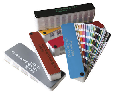
Pantone has swatch books that show inks printed on coated
and uncoated papers. The process book gives you the cyan, magenta, yellow and
black (CMYK) values used in four-color process printing. Pantone also offers
swatch books for spot colors or Pantone Matching System (PMS) colors.
Unlike CYMK process printing, PMS colors are printed with
single ink. If a client specifies PMS 320 blue for a logo, he is talking about
a solid color ink. In fact, many times designers are told to use a specific PMS
color in a printed document, and then run into problems. One of the realities
of printing is that not every spot color can be matched exactly using CMYK
inks. If a color needs to match absolutely perfectly because of corporate logo
standards, you might need to use the PMS color. However, this means that the
printer actually has to run a separate plate for that single PMS ink color.
Obviously, adding that extra plate incurs extra charges. You should proof your
separations to make sure that you have specified colors correctly. It’s all too
easy to inadvertently add unintended spot colors into your job.
For years, Pantone offered another guide called the Pantone
Solid to Process Guide, which showed the CMYK equivalents of many PMS colors.
Pantone replaced this guide with a system called Pantone Color Bridge in an
effort to make the spot color to CMYK breakdown more accurate. Unfortunately,
this change hasn’t been particularly well publicized and people don’t
necessarily update their swatch books or their software very often.
Many people still use the old swatch books and the old
spot-to-process formulas remain in many software applications. It’s important
when you are designing to make sure all
your applications are using the same color specification. For example, if the
marketing department is doing the cover of an annual report and the editorial
department is working on the inside pages, you need to make sure everyone is
specifying the exact same color using the same color system to avoid color
shifts. If one person or department uses Color Bridge, everyone needs to follow
that lead. Similarly, if you have exported an EPS graphic with the old color
values and then import it into InDesign, which uses the new Color Bridge
values, the colors won’t match correctly.
Fortunately, Pantone has made it easy to get everyone on the
same playing field. The company offers a Color Bridge installer as a free
download from their Web site at http://www.pantone.com (click Support and then
Color Library Updates). You need to become a “member” of the site first. After
you download the new libraries, the installer loads the Color Bridge CMYK
library into your graphics programs. When you select the colors from the library,
the CMYK values will be consistent with those in the new Pantone Color Bridge
guides.


Comments
Post a Comment