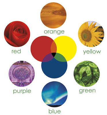
The Psychology of Color in Printed Materials

When you design a piece that will be printed in color, you
have to make decisions on the colors to use. Rather than just selecting the
first color swatch your mouse happens to click upon, it pays to think about the
impact your color choices have on the end product. According to the Institute
for Color Research, “all human beings make a subconscious judgment about a
person, environment or item within 90 seconds of initial viewing and between
62% and 90% of that assessment is based on color alone.” Clearly, the impact of
the colors you select is considerable so you want to put some thought into your
choices.
Unfortunately, people’s perceptions of color vary and their
views on colors are quite subjective. However, some factors are reasonably
consistent. For example,
if you’ve ever walked into a Target store and heard children
screaming, consider all those red walls. Red is a strong, bold color that is
energizing. (The kids in Target are certainly wound up in any case.)
Although red might not be the greatest choice for store
walls, it can be effective in marketing materials because it adds a lot of
punch. When it comes to your printed pieces, the addition of a bold, exciting
color can be a good thing because it gets noticed.
The old saw that says “a picture is worth a thousands words”
applies to color. The addition of color makes an impression on people. Studies
have shown that people read and remember color ads more than black-and-white
ones because the color holds their attention longer.
Because colors appear in nature, many times you can evoke a
mood or idea just with color. For example, blue appears in the sea and sky
making it a good choice for anything having to do with water or air, such as a
logo for an air conditioning, airline or aquatic company. In much the same way,
because green is associated with nature and plants, you might use it for
projects having to do with landscaping, nutrition or ecology.
Be sure to consider your color choices in the context of the
other colors in your marketing materials. At the most basic level, black text
on a white piece of paper is always going to have the highest contrast. White
text on a black background can be somewhat more difficult to read, but still
has a lot of contrast. The situation gets much more complicated when you add
color into the equation because a color can look completely different,
depending the colors near it.
For example, if you place red on a black background, it
appears brighter and larger than it does on a white background. If you place
red on a reddish or orangey background, that same brilliant red can fade out.
And if you place the red on the wrong background, such as blue, it can almost
appear to vibrate.
In your printed materials, it’s a good idea to use color to
direct the reader’s eye to the most important areas of the page. More is not
necessarily better when it comes to color. The old adage holds true that when
you try to emphasize everything, often you emphasize nothing. A brochure is
supposed to be read, therefore you should use color judiciously as a tool to
help the reader comprehend your message.
A whole rainbow of colors is available to you. With a little
common sense, it’s easy to use color effectively to enhance your marketing
materials. Choose your colors wisely and you’ll be rewarded with powerful
brochures and collateral materials that get your ideas across.


Comments
Post a Comment