Posts

Showing posts from February, 2016

Green Sheets

Image
Green Sheets Which has a greater impact on the environment: printed materials or electronic content? Conventional wisdom says that printed materials result in fallen trees and discarded paper clogging up landfills. But studies from Germany found that electronic newspapers can actually have a greater environmental impact than print newspapers. This is thanks to the energy required to make content available 24/7 on electronic devices, as well as the energy consumption of the required devices, not to mention discarded batteries clogging up landfills. Environmental impact is less straightforward than we think, and while electronic media reduce paper consumption and landfill use, they use more energy. So the use of electronic media over paper trades a renewable resource (trees) for a non-renewable one (fossil fuels used in energy production). Print can actually be more environmentally friendly than electronic media, but there are opportunities to make it even

Pro-Tips For Rocking Your Next Trade Show

Image
If you've ever worked a boring booth at a trade show, you've most likely been the victim of the "avoiders." Those passers-by who liken you to Medusa and refuse to look your way for fear of being turned to stone. You notice them by the way they engage actively with booth 1145, take a quick glance at your booth with that lonely poster and brochure, and then, hurriedly walk past you with their eyes carefully averted. After enough of these avoiders, you may start to wish you had some of those smiley-faced, squishy stress-balls to throw at them. This year, with some careful planning and a little creativity, you may be able to grab people's attention and keep them engaged without resorting to assault and battery. Obviously, the lengths that you go to create interest at your booth may be limited by your budget, so it's important to think about what this trade show means to your business and how engaging 10, 50, or even 1000 target individuals may bring more work

Print Marketing - What Was Once Old is Now New Again

Image
Recently, a prospective client said they wanted to get customers' attention through non-traditional marketing using printed products. Who knew that in 2016, the printed word would be considered "non-traditional?" Non-traditional? We're saying this about a medium that was developed back in the 1400's by Johannes Gutenberg! While Webster's (of dictionary fame) mind might be little blown by this reference, when you think about it, it actually makes a lot of sense. For the past two decades, digital media has been rapidly replacing many of our formerly traditional ways of doing things, from watching television, reading the newspaper, to yes...print marketing. With the democratization of information that the internet has brought, more and more people are consuming this information digitally. Social media and search engine algorithms target our interests and bombard us with advertisements directed at those interests, to the point that we've become immune to t

Why Fonts Matter.

Image
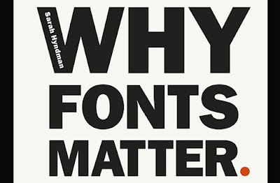
Why Fonts Matter, and how they impact your mood. Words by  Sarah Hyndman ,  Tuesday 26 January 201 6 Originally publishes on www.itsnicethat.com/articles/why-fonts-matter-sarah-hyndman-260116 Typography might just help you date, solve obesity and impact your mood; so we’ve learnt from type fanatic Sarah Hyndman. We’ve  previously dubbed her  “the one woman tour-de-force behind the Type Tasting enterprise”, which looks at the power typography has over our lives and senses. She’s now published a new book on the subject,  Why Fonts Matter,  and has kindly offered us an extract looking at the effects of typography on our emotions. Physically, we use our voice, facial expressions. gestures and posture to convey a wide range of emotional cues from the subtle to the dramatic. Typefaces and the way they are used provide a similarly extensive emotional range typographically.  Read more...

Google's New Cohort Analysis

Image
If you are already heavily into online marketing analytics, this may rapidly become one of your more valuable marketing analysis tools. If you are a newbie to marketing analysis and are not yet familiar with Google's new tool, here is some help in understanding what it is all about. First of all, cohort analysis is not new. It is Google's tool that is new. A dictionary definition of a cohort is simply a group or band of people. That notion is at least as old as Ancient Rome, where a legion of soldiers was broken down into ten cohorts. In its more current usage, cohort analysis has been performed for many years. Insurance companies, for example, have used this idea to create data for actuarial tables, mortality rates, etc. Simply put, cohort analysis is the breakdown of populations into smaller, easily definable groups. The purpose of analyzing the characteristics of these sub-categories is to determine common behaviors usually specified in relation to a time period in t

Endurance Can Make All the Difference

Image
Entrepreneur and author Matthew Paulson has characterized entrepreneurship as an endurance sport. It is true that sometimes if you see you are on the wrong track, the best course of action is to abandon the original plan and start in a new direction. However more times than not, just sticking with it can often make all the difference between success and failure, winning and losing. Famed cinematic genius Walt Disney is quoted as saying, "The difference between winning and losing is most often ...not quitting." In another famous quote referring to the opinions of pessimistic critics and detractors he said, "It's kind of fun to do the impossible." He should know. Walt Disney achieved some of the most spectacular success anyone has ever reached in cinema, winning 22 Academy Awards and more awards and nominations than anyone else in history. He did so by overcoming rejection of his ideas and doing "the impossible." Disney's most profound idea,

Employee Engagement: The Most Important Aspect of Your Business You're Not Paying Enough Attention To

Image
As a marketing professional, one of the core qualities that drives success in nearly everything that you do ultimately comes down to creativity. The employees that you've hired have to be free to let their creative juices run wild, turning in the types of materials that establish a direct link with your target audience in bold and innovative ways on a daily basis. Making sure that they have the tools necessary to unlock that underlying creativity is no doubt something that you think about daily. A related point that is just as pressing (if not more so), however, is just how engaged those employees are in the first place. You could hire the most objectively creative or hard-working employee that you could find and it ultimately won't make much of a difference if they are actively disengaged from the environment they're working for in the first place. Employee engagement, in general, isn't just one of the most important things to concern yourself with, but it's ar

The Psychology of Color in Printed Materials

Image
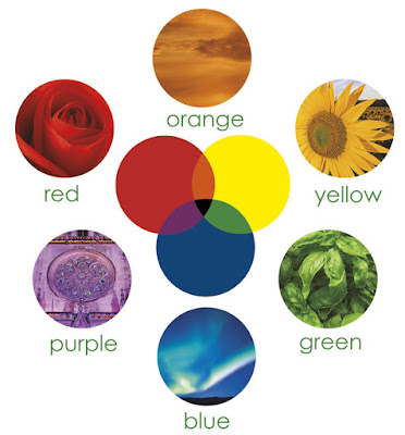
When you design a piece that will be printed in color, you have to make decisions on the colors to use. Rather than just selecting the first color swatch your mouse happens to click upon, it pays to think about the impact your color choices have on the end product. According to the Institute for Color Research, “all human beings make a subconscious judgment about a person, environment or item within 90 seconds of initial viewing and between 62% and 90% of that assessment is based on color alone.” Clearly, the impact of the colors you select is considerable so you want to put some thought into your choices. Unfortunately, people’s perceptions of color vary and their views on colors are quite subjective. However, some factors are reasonably consistent. For example, if you’ve ever walked into a Target store and heard children screaming, consider all those red walls. Red is a strong, bold color that is energizing. (The kids in Target are certainly wound up in any case.) Altho

Understanding Pantone’s Color Changes

Image
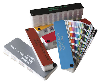
“With Pantone swatch books, you can see a sample of the actual ink on paper. This way you don’t have to guess when you select colors in your projects.” As a graphic designer, the name Pantone should be familiar to you. Most designers and virtually all printers use Pantone color guides as a reference tool. The color you see on your monitor screen or printout might be quite different from the color that ends up printed on paper by a printing press. With Pantone swatch books, you can see a sample of the actual ink on paper. This way you don’t have to guess when you select colors in your projects. Although the swatch books might seem somewhat pricey, they are a worthwhile investment. Pantone has swatch books that show inks printed on coated and uncoated papers. The process book gives you the cyan, magenta, yellow and black (CMYK) values used in four-color process printing. Pantone also offers swatch books for spot colors or Pantone Matching System (PMS) colors.