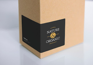
Expert Advice for Classy Custom Labels
In today's visually-oriented market, brand persona is everything.
Strong, simple visuals go a long way toward giving you a rock-solid image to stand tall above competitors and to capture customer attention.
While companies work hard to shape outbound marketing, they can easily overlook options for the packaging and presentation of their products. Even simple tweaks can go a long way in making your brand shine!
Custom printed labels can offer a durable, stunning accent to your product or printing. But there are many variables when it comes to printing labels. From the right materials to laminate finishing, it's hard to know where to begin.
Here are a few tricks we've learned over the years to help you craft labels to heighten brand appeal.
Less is More.
When it comes to labels, it's important for your message to connect immediately.
When a label has complex fonts or busy designs, it can be difficult for readers to engage with your product. Keep your designs, images, and borders clean and simple for maximum user experience. If you post nutrition facts, make them as concise and reader-friendly as possible. Non-standard shapes or labels that match your package size are a great way to bring precision and flair.
Color is King.
Want to stop them in their tracks?
Colors command attention and make your message sing.
Try splashes of color against neutral backgrounds, or complementary colors that bring depth and warmth. If your label intends to communicate flavors, seek to pair colors that carry these natural associates (like greens for lime or orange for citrus).
As you design label colors, your goal is to help users find or associate with your product more easily. If you already have a branded color scheme, use this as your prominent theme. Colors help customers recognize your product and feel secure when they purchase in the future.
Fonts Rule.
Nothing says sleek like a perfectly sketched font.
Work to find the right balance of clean and clever. If a font is too generic, it will be easily missed. If it's too wild, it may be hard to read or seem silly. Stick to a font you've branded your company with, or use two fonts (max) to keep your label coherent and easy to read.
Experiment with font pairings: consider a headline that's bold and condensed with a copy that's light or vertically stretched. Or try an all-caps serif with an italicized sans serif to compliment. Test your font pairings on volunteers or gather feedback from artistic friends before finalizing a design.
Consistency Counts.
Labels help you build a personality.
What message will you send? What ideas do you hope to convey?
Keep your labels consistent with your brand identity, looking for distinct features you can highlight or graphics that illustrate your story. 19 Crimes Wines uses an interactive "Living Labels" app to allow each wine to unveil a mystery. Fieldwork Brewing uses blown up oceanside photos for its Island Time Sour Ales. Fit Buns High Protein Bread comes in a box that makes the pastries look like a ripped dude's abdominal "6-pack." The label also conveniently features a free fitness center coupon inside. Also, remember to keep your contact information accessible so customers can visit your website or contact you with feedback.
Let's face it: in the marketplace, beauty is often skin deep.
Your label is a representation of the things you've worked hard to build, so go the distance to make your brand stick. Need ideas to get you started? From hangtags to custom adhesives, we're your one-stop shop for creative label options!


Comments
Post a Comment